
Plotting Exoplanet Archive Data
The Exoplanet Archive has a web-based tool that can easily produce scatter plots and histograms of data that are available in the archive. The archive also offers pre-generated plots that are ready-to-publish versions of what can be created manually from the interactive tables.
This page describes how to access and use the scatter plot and histogram functionality.
Skip to a section:
- Accessing the Plotting Tool
- Using the Scatter Plot Function
- Using the Histogram Function
- Creating a Histogram Plot From a Column of Discrete Values
- Zooming Behavior in Histogram Mode
Accessing the Plotting Tool
The Exoplanet Archive's scatter plot and histogram tool can be accessed in any of three ways:
-
By clicking on the Confirmed Planets Plotting Tool button on the home page.
-
Through the toolbar of any interactive table, such as the Confirmed Planets table. (Click the Table Plotter button and select Plot Table.)
-
Through the toolbar of any results table from a data set search, such as SuperWASP or Kepler Stellar. (Click the Table Plotter button and select Plot Table.)

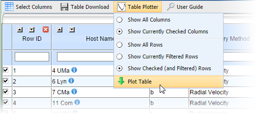
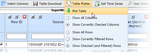
Before using the plotting tool through an interactive table or data set, you must indicate which data from the table you want to send to the plotter. By default, all the currently checked columns and currently checked (and filtered) rows in the table will be exported. You can modify this set by selecting Show All Columns, Show All Rows, and/or Show Currently Filtered Rows.
To start the plotter, select Plot Table. The selected table data are automatically sent to the plotter and a new browser window will open and display the plot. The control panel on the left defaults to the Scatter Plot function. There is also a row of icons along the bottom of the window that mirror the options in the control panel (these buttons allow you to continue manipulating the plot when the control panel is hidden).
The plotting function, when accessed through one of the archive's interactive tables (such as Confirmed Planets or KOI, can be used to further investigate exoplanet properties for the ensemble of known exoplanets and/or Kepler candidates. Users can narrow down the list of planets used in the plots, such as plotting only for planets less than, or more massive than, the mass of Jupiter.
Some possible use cases include:
- Plotting the eccentricity-period diagram of known exoplanets
- Plotting the mass-period diagram
- Plotting the host star mass vs. planet period
Using the Scatter Plot Function
In the left panel of the plotting tool interface, the Scatter Plot tab has four sub-tabs: Data, Axes, Lines, and Errors. These tabs contain controls that allow you to customize the plot along, with a Redraw button to render the new plot.
The Data sub-tab allows you to specify which column to plot, along with a text box to enter a descriptive title for both the X and Y axes. A Symbols box allows you to specify the shape, size, and color of the plotted data point by clicking on the appropriate attribute and again on the desired selection in the pop-up bubble.
The Axes sub-tab contains controls that allow you to enter a plot title and customize the colors for the plot background and each of the axes labels. Controls also exist for modifying the scaling of each axis, including, linear, logarithmic, and manual or auto-scaling. In auto-scaling mode, each axis will be scaled large enough to include all data exported to the plotter. There are two ways to zoom in on a specific region of the plot: either click, drag, and release the mouse directly on the plot over a cluster of points of interest, or selectg Manual mode and specify the minimum and maximum data ranges for each axis.
In the Lines sub-tab, you can create line plots with custom line styles, colors and widths. Checking the Hide all lines checkbox allows you to remove these lines when you click Redraw.
The Errors sub-tab contains controls that allow you to select any exported data column to serve as plus and minus error bars for the selected X and Y data values. Checking the Hide all error bars allows you to remove these error bars when you click Redraw.
To increase the size of the plot within the window, you can resize the left control panel by grabbing the handle on the right side of the frame and dragging to the left. Any time the plot is resized, it is also redrawn with the new settings.The icon tray at the bottom of the window below the plot allow you hide/show the left control panel, zoom in/zoom out, refresh the plot to its default size and scaling, and to download the XY data in ASCII table format.
![]()
The four icons at the bottom-left area of the plot window correspond to the Data, Axes, Lines, and Errors tabs from left to right, respectively.
- Double-clicking on any of these icons hides the left control panel, increasing the size of the plot.
- Clicking once on any of these icons reveals the corresponding panel for the selected tab.
- The set of magnifying glass icons allow for zooming in (+), zooming out (-) about the center of the plot, and the Reset (with the R) icon will reset the plot to its original scale.
- The download icon (with the spreadsheet and arrow) allows you download the plotted data in IPAC ASCII format to your local device.
- The red/green indicator next to Axes autoscaled indicates whether the plot axis scaling is in auto (green) or manual (red) setting mode.
Using the Histogram Function
Click on the Histogram tab to change modes. There are two sub-tabs:
- The Column/Colors sub-tab gives you control over the histogram's appearance, including the axes labels, the name of the histogram itself (Histogram Plot Label) and the border, fill, axes, label and background colors.
- The Binning/Scaling sub-tab gives you control over the scaling and binning of the data.
Important: Make sure to click Redraw on either sub-tab to view the plot with your new selection(s).
The icons below the plot provide additional options, including downloading the plot and displaying the histogram data in a table; a tooltip displays when you rest the cursor on the icon indicating each button's function.
Zooming to a specific portion of a histogram can produce different results, depending on the options selected. The following table describes two of the most useful scenarios and and how to achieve them.
| Data Binning Setting (X Axis) |
Count Axis Setting (Y Axis) |
What to Expect |
|---|---|---|
| on/checked | Auto | When the Count Axis Setting is in Auto mode, the Count Axis minimum is always 0. |
| off/unchecked | Manual | When in Manual mode, the tool magnifies the selected region of the histogram; it performs no new calculations. |
The following procedure explains how to make a presentation-ready plot using discrete values.
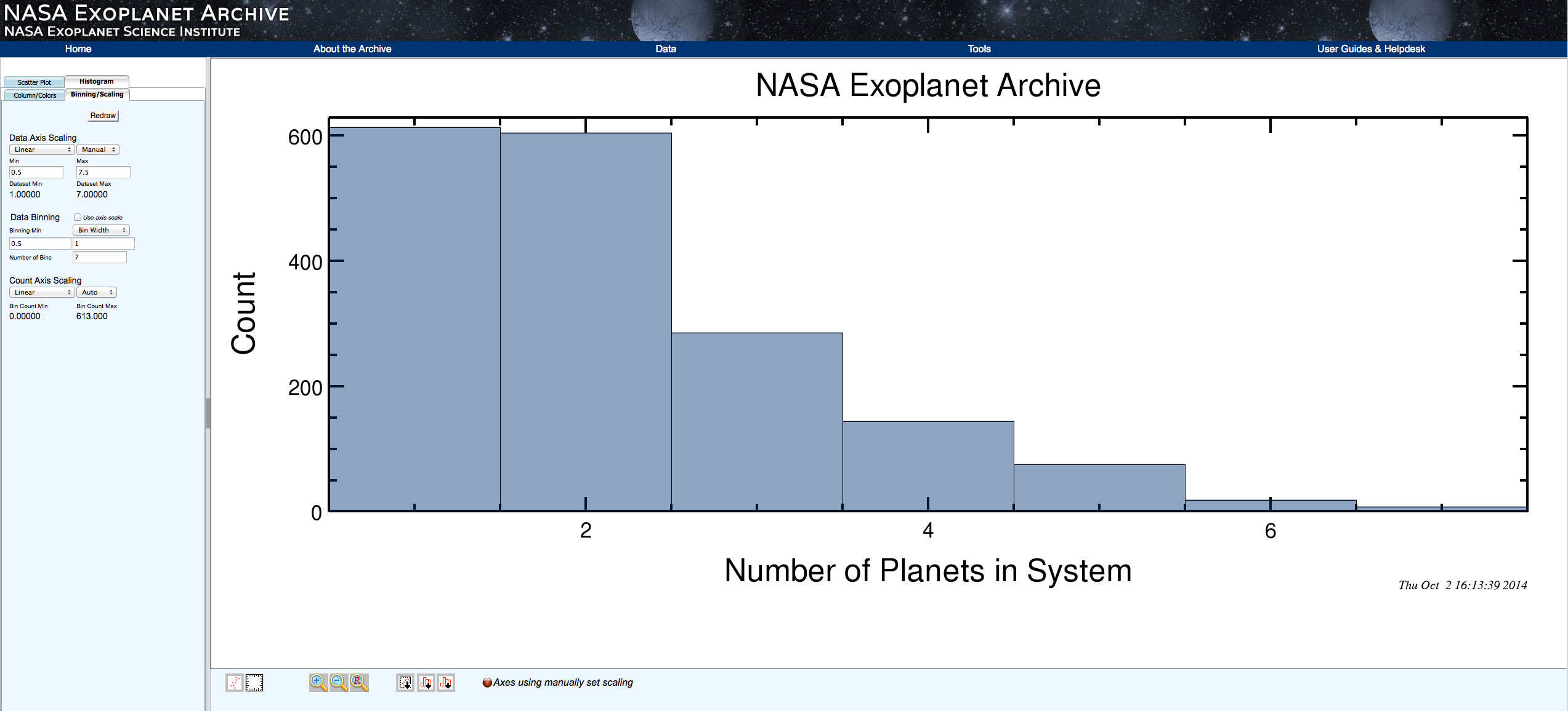
- On the Histogram tab, select the Column/Colors sub-tab. From the Column drop-down menu, select the parameter you wish to plot. In this example, we will use the Number of Planets in System column. This column has data in discrete integer values ranging from 1 to 7.
- Switch to the Binning/Scaling sub-tab. You will see several options for editing the axes and bin sizes. Underneath the first option, Data Axis, the minimum and maximum values of the selected column are displayed.
- If necessary, change the Data Axis from Log to Linear.
- Change the Auto setting to Manual.
- Change the minimum value to half the desired bin width less than the minimum value of the column. For the Number of Planets in System, with integer values, the desired bin width is 1, so the minimum value for the data axis is 1-(half the bin width) = 0.5.
- Similarly, change the maximum value to half the desired bin width more than the maximum value of the column; in our example, 7+(half the bin width) = 7.5.
- In the same manner, we must edit the second option, Data Binning, to have the minimum and maximum values we have calculated above (0.5 and 7.5 for our example); and set the number of bins to the number of discrete values, in this case 7.
Alternatively/equivalently, we can set the minimum to 0.5 and change the drop-down selection to Bin Width and choose 1, and again set the number of bins to 7. The Count Axis scale default options should remain unchanged. Note: The Bin Width option is only available for linear Data Axis scaling. - Finally, click Redraw to produce the histogram.


Standard method (left) and alternate method using Bin Width (right)
An example plot for the Number of Planets in System column is shown below (click image to enlarge).
Last updated: 11 November 2014


![]()
![]()