
How to Use the Interactive Time Series Viewer
Skip to a section:
- Overview and System Requirements
- Conducting a Search
- Using the Interactive Time Series Viewer
- Plotting the Data
- Sending Data to the Periodogram Service
- Normalizing the Plotted Data
- Downloading Plots and Data
- Known Issues
Overview and System Requirements
The Interactive Time Series Viewer is a dynamic interface that allows users to view and interact with all of the Kepler light curves currently available in the Exoplanet Archive.
To access the service, click the Kepler Light Curves link on the NASA Exoplanet Archive home page.
For best results, we strongly recommending using newer versions of the Firefox Web browser when using the Interactive Time Series Viewer. Any version of Internet Explorer is currently not supported by this interface.
Allowing Pop-up Windows
Please make sure your Web browser is set to allow pop-up windows from the exoplanetarchive.ipac.caltech.edu. For more information, read the respective help file for your browser version and platform:
- Firefox (any platform)
- Google Chrome (any platform)
- Safari 5 (Mac): Choose Safari > Block Pop-Up Windows to toggle this setting, or press Shift-Command-K
Conducting a Search
Search by Kepler ID Number
- From the NASA Exoplanet Archive home page, click the Kepler Light Curves link to view the Exoplanet Transit Survey Kepler Search page.

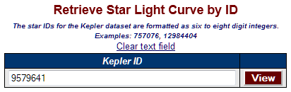
- In Retrieve Star Light Curve by ID section, type the Kepler ID number in the Kepler ID field and click View. In this example, we use Kepler ID 9579641.
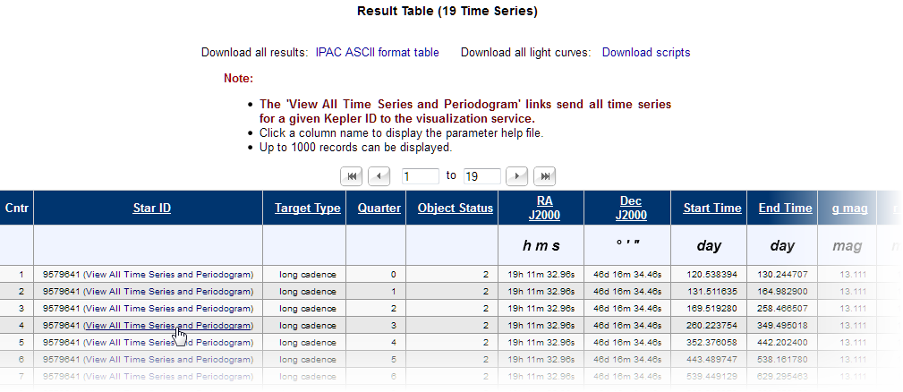
- A list of available quarters for that Kepler ID displays on the following page. Click the View All Time Series and Periodogram link in the Star ID column to view the light curves. The table will extend beyond the scope of your Web browser; it's best to maximize the window and use the scroll bar to scroll from left to right.
Note that all quarters will be available on the viewer page and the first quarter is displayed by default. You may refine the plot by viewing additional quarters from the viewer page.
Also, note that you may opt to download all of your search results so far from this page by clicking the Download all results: IPAC ASCII format table or Download all light curves: Download scripts links at the top of the page. See Download Plots and Data for more downloading options.
- The next page is the viewer page that displays a visual representation of the available source data (a "plot"). Proceed to the Using the Interactive Time Series Viewer section to learn how to use the tool.
Search by Parameter
If you do not have a specific Kepler ID, you may browse the archive by searching on specific parameters in the Search for Star Light Curves by Constraint area. Simply select or type your search constraints in the online form and click Submit.
Using the Interactive Time Series Viewer
The Interactive Time Series Viewer provides a graphical preview of time series data that can be manipulated within a Web browser.
The collection of tabs at the top of the page provide additional controls and functionality with your selected time series.

Each tab does the following:
- Plotting: Provides a visualization of the time series.
- Periodogram/Phase Curve: Provides a periodogram or phase curve of the time series data. Note that if a Kepler ID has no orbital periods in the archive, you will be asked to manually specify the period if you select Phase Curve.
- Normalization: Adds a new column to the plot that contains normalized data.
- Source Download: Provides export functions so the time series files can be downloaded. (This features requires that wget is installed on the destination machine.) Note that the visualized plot itself is downloaded by clicking Download Plotted Source Columns or Download Plot on the Plotting tab.
Plotting the Data
The Plotting tab of the viewer displays two sizes of the same light curve; the smaller plot contains a blue rectangle that represents the section of the light curve on display in the larger plot.
There are a few controls you can use to manipulate the scale and scope of the larger plot:
- Click the Zoom In and Zoom Out buttons to change the level of detail displayed in the larger plot. Note that the size of the blue rectangle in the smaller plot is an approximation of the area displayed in the larger plot.
- If needed, click Reset Zoom to return to the default view of 100%.
- To view a different area of the larger plot that is the same size/scale, place your cursor on the edge of the blue rectangle and drag and drop it to a another area of the plot.
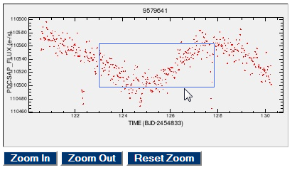
For best results, avoid clicking the buttons too quickly in succession, as it may cause the Web page to freeze. If this occurs, hold the Shift key and refresh/reload the page.
Adjusting the Plot Settings
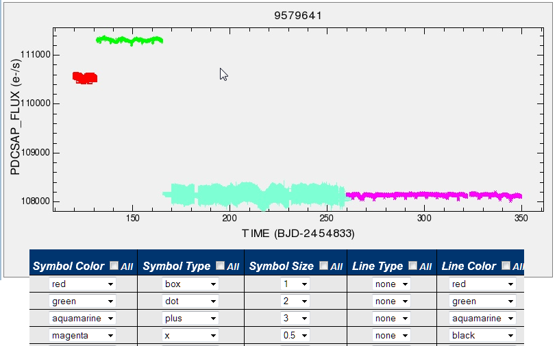
The bottom pane of the Plotting tab screen (which is resizable) contains a table for adjusting the plot settings, such as specifying line and symbol color, type and size. You may also specify the columns to use for the x- and y-axes. If there are multiple time series listed, checking the All box next to each column heading makes all selections in the column the same as what is selected in the first row.\
To assign a color to a plot line, check the box in the Select column for each period you want to display, then scroll to the right and select a color from the Line Color drop-down menu. Click Update Plot.
The example below shows the selections (foreground) and the resulting plot (background).
Selecting Columns for the X and Y Axes
The X Axis and Y Axis drop-down menus in the bottom pane can be used to specify different data columns for each axis. Make your selections and then click Update Plot.
Sending Data to the Periodogram Service
From the Periodogram/Phase Curve tab, you may send the data to the Periodogram Service for further processing. When you click on the tab, there are two sub-tabs: one for periodogram controls and one for phase curve controls. On the right is a menu for selecting your time series. Note that any selections you made on the Plotting tab are not carried over to this tab.
Once you've set the desired controls for either service, click Compute Periodogram or Phase Curve. The default algorithm for periodograms is Lomb-Scargle, but you will have the option to change to a different alogorithm (e.g., BLS or Plavchan) from the results page.
A single element page, no per-source selection (although that will be added later).
Instructions to get wget
Kepler FITS file download script - the raw FITS files as provided by the Kepler mission.
Kepler IPAC ASCII tbl file download script. These are the files we converted from the FITS. This is a straight conversion, nothing added by us. Any normalized columns will not be present in the TBL files available for download via these scripts.
Normalizing the Plotted Data
The Interactive Time Series Viewer offers basic functionality to normalize the data so large gaps of time within the data are filtered out. The method is limited to division by median division and subtraction by median subtraction. Median value is calculated from the median of the selected column, with null values disregarded.
To use this feature, you must specify two constraints:
- Which source column to use for the median: select from the Source Column drop-down menu, and
- Whether to divide or subtract by the median: select from the Method drop-down menu.
Click Normalize after making your selections.
You may also specify a prefix for the selected column in the Normalized Column Prefix field. The resultant name of the new column will hold the normalized values. If the column name already exists, the system will display an error message and you will need to specify a different prefix in order to proceed.
When normalization is completed, the system will notify you with a pop-up window. The new column has been added to all of the column drop-downs (e.g. X Axis, Y Axis) for all the services. You can now select this column for phasing, plotting or periodogram computation. To download it, plot it and click the Download Plotted Source Columns.
Downloading Plots and Data
From the Plotting tab:
- The Download Plot button displays the larger plot as a .jpg file that can be saved locally. You can adjust this setting by toggling between the All Records (all records in the plotted columns) and Zoomed Records (only the records in the zoomed plot) radio buttons.
- Download Plotted Source Columns produces an IPAC ASCII .tbl file containing only the two columns that are plotted.
In the event that the same columns have been plotted for multiple sources, the source column names will be preserved. If you plot different columns for each selected source, the column(s) will be abstracted as variations of X/Y.
From the Periodogram/Phase Curve tab:
- On the periodogram results page, there is a Download button to save the processed phased curve in IPAC ASCII table format.
- There is also a Download button on the same page to save the the most significant periods.
From the Source Download tab:
Both links on this tab require that wget is installed on your system so you can download and open the .bat file.
- The Kepler FITS Source Files link is for the raw FITS files as provided by the Kepler mission.
- The Kepler Source Files converted to IPAC ASCII link is for the files converted from the FITS. This is a straight conversion; the archive has not added anyting to the data. Any normalized columns you have added will not be included in the .tbl files.
Known Issues
Issue: The colors assigned to lines and colors are not showing in the larger plot.
Possible Solution: The plot will not reflect your changes until the Update Plot button is clicked. The button turns red when selections have been made that have not yet been processed.
Issue: The Web page becomes unresponsive while using the Zoom In, Zoom Out, and Reset Zoom buttons.
Possible Solution: The viewer relies on JavaScript, which can get overloaded when too many selections are made too quickly. Try slowing the pace of your zooms. Also, the viewer is most effective on newer version (v5.x and up) of Firefox. Currently, the viewer does not support any version of Internet Explorer.
Issue: When using Internet Explorer, the Update Plot function occasionally stalls and displays the loading message indefinitely.
Possible Solution:This is a known issue. If it happens, simply reload the Web page to reset the page.
Issue: After changing the Y Axis in the current selection and clicking Update Plot, the units disappear in the plot.
Possible Solution:This is a known issue. If it happens, simply click Update Plot again (without changing and selections) and the units should re-appear.


![]()
![]()